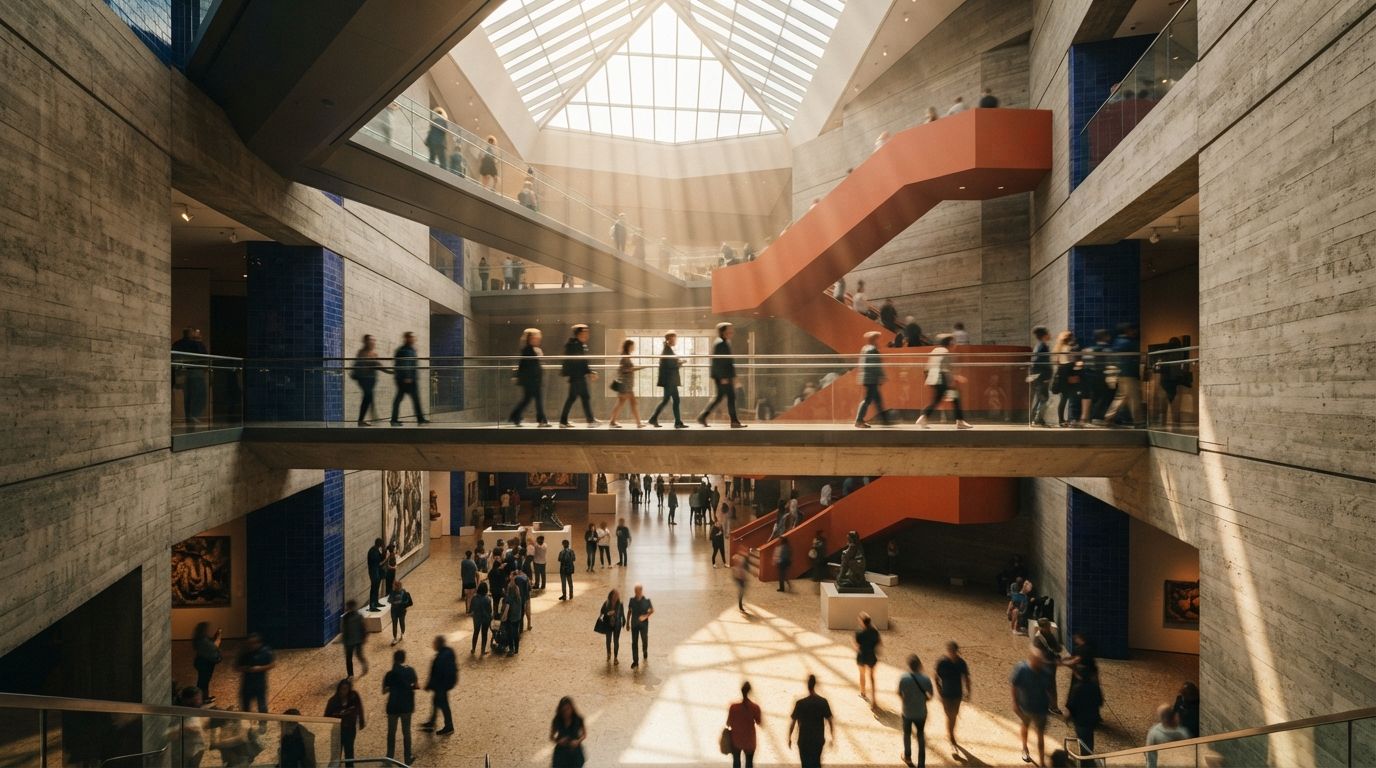
This week's sweep pulled two threads with the same shape. One asks for a ComfyUI workflow to push architectural renders toward photographic enhancement, keeping the model's structure while improving light, materials, reflections and planting. The other is blunter: the end goal is renderings that look indistinguishable from a photograph, and does anyone have a route. Both threads are full of generous, competent answers. Both treat indistinguishability as an obviously good thing to want, the way you would want a sharper pencil.
I understand the pull. Photoreal has been the profession's shorthand for quality since the first ray tracer, and for twenty years it stayed out of reach for anyone without a specialist and a render farm. The pull is not the problem. The problem is that the goal was set back when it was unreachable, so nobody had to think about the far side of it. We are now on the far side.
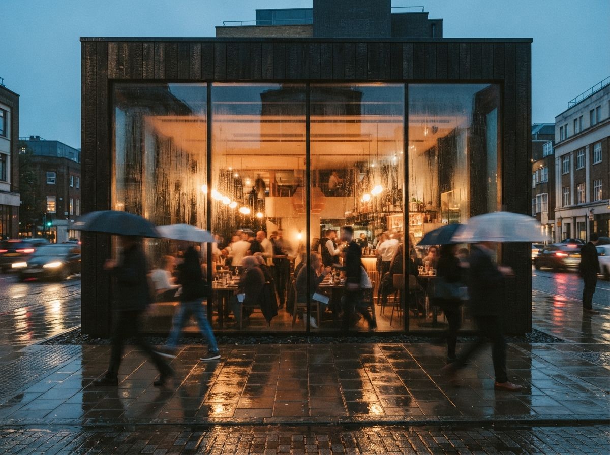
The gap that is left is not a tool gap
Worth saying plainly, because the threads are full of people hunting for the one node that closes it: on a well-built model with decent inputs, the remaining distance to photographic is mostly not software. It is the physics of the thing, light that has a source, materials at the right scale, reflections that agree with the room, wear where people touch. We have written that out at length in the five physical tells, and the honest summary is that the tells are learnable and the gap is closable, this year, by a careful architect on ordinary hardware. That is the change. Indistinguishable used to be a boast. It is turning into a default.
A drawing proposes. A photograph testifies. When the render passes for the second, it carries a claim you never meant to make.
What the image is understood to be saying
Every representation carries an implicit claim, and the claim is set by the genre, not by the caption. A section is understood as an assertion about construction. A sketch is understood as a proposal, provisional, arguable, and everyone in the room reads it that way without being told. That legibility is doing quiet work. It tells the viewer how much to trust the image and how much to push back on it.
A photograph sits at the far end of that scale. It is read as evidence, a record of something that stood in front of a lens. That is why estate agents shoot rooms rather than draw them, and why a planning committee looks at a photomontage differently from an artist's impression. The genre is the trust signal.
So when your render crosses into photographic, it does not just get better. It changes genre. The viewer stops reading a proposal and starts reading a record, of a building that does not exist, has not been costed, has not been through value engineering, and may never be built at all. You did not say anything untrue. The image said it for you, in a register you did not choose.
Where the line actually bites
This is not an argument against photoreal work. It is an argument that the answer depends entirely on who is looking and what they will do next. The same image is fine in one room and a liability in another.
| Where the image lands | Photographic finish | Verdict |
|---|---|---|
| Concept and schematic, internal | Reads as decided, kills the argument early | Wrong tool. Loose beats resolved |
| Design review with the client | Client stops critiquing, starts approving | Careful. You wanted the critique |
| Competition or portfolio | Genre is understood by everyone in it | Fine. The room knows the rules |
| Sales and marketing material | Buyer reads it as the flat they will get | Risk. Consumer protection is real |
| Planning submission | Committee reads it as verified view | Disclose, or use a verified method |
| Press and social | Circulates stripped of all context | Assume no caption survives |
The concept-stage row is the one architects get wrong most often, and we have argued the case for deliberately unresolved images at the concept stage already. The bottom three rows are the new ones. They are where the image leaves the room, meets someone who was not in the conversation, and has to speak for itself.
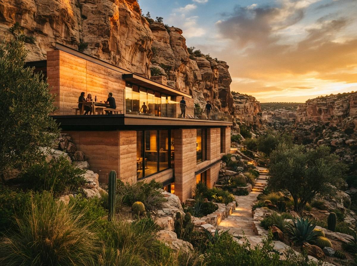
The disclosure problem, without the hand-wringing
The obvious answer is to label everything, and the obvious objection is that a label undercuts the image you just spent a day on. Both are half right. A blanket "AI generated" stamp is close to useless, partly because it tells the viewer nothing about accuracy, and partly because within a year or two it will be true of nearly every image in the set. It is noise, and noise gets ignored.
What a viewer actually needs to know is narrower and more useful: which parts of this image are measured, and which parts are invented. That is a claim about accuracy, not about tooling, and it survives the technology changing under it.
Say what is surveyed and what is imagined
"View from the surveyed camera position, massing and heights to the submitted model, materials and planting indicative" is a sentence a committee can act on. It concedes nothing about your competence. It says the geometry is a claim you stand behind and the boucle throw is not. Most of the trouble in this area comes from images that quietly imply both are equally real.
Match the method to the stakes
If the image is doing evidential work in a planning context, a verified view procedure exists for exactly that, with survey-located cameras and a documented method. It is more work and it is the correct amount of work when a committee is deciding on the strength of what you showed them. An AI-enhanced approximation dressed as a photograph is the worst of both, because it invites the trust of the first and provides none of the discipline of the second.
Assume the caption gets lost
Images circulate naked. Your careful qualifier lives in the PDF, and the JPEG that ends up in a local newspaper or a resident's group thread has none of it. If the image cannot afford to be misread when the caption falls off, that is a fact about the image, and no amount of small print fixes it. Design the picture so its status is visible in the picture.
Our take
Chase the skill. Nothing here is an argument for renders that look worse, and the craft that closes the last ten percent, light logic, material scale, restraint with entourage, is the same craft that makes a modest image convincing. Learn it. It transfers to every tool that will replace the one you are using.
But retire the idea that indistinguishable from a photograph is the finish line, because it is not a quality target at all. It is a genre target, and the genre carries claims about truth that a design proposal usually cannot back. The useful question was never "can I make it look real." It is "what should this specific image be understood to promise, and to whom." Sometimes the answer is a photograph. More often it is an image that is clearly, deliberately, a proposal, and reads that way to a stranger with no caption in hand.
The old constraint did that work for us. Our renders looked like renders because we could not make them look like anything else, and every viewer calibrated accordingly. That guardrail is gone and nothing replaced it. What replaces it is judgement, exercised one image at a time, about what you are actually asserting.
Make it as good as you can. Just know what you have made.
Written from the 16 July 2026 intel sweep, which flagged r/comfyui threads on architectural render enhancement and on renders indistinguishable from photographs, alongside the week's AI archviz tool coverage.