The question is no longer whether your portfolio will include AI-generated imagery. It already does, or your competitors' portfolios do, or your client's expectations have already been set by someone who does. The question is whether the AI work in your portfolio is any good.
We've been building and rebuilding our own portfolio at Vista Studios for two years, running every tool through real projects before recommending anything here. What follows isn't a tool pitch. It's the actual decisions, what to include, how to make it, how to present it, where the whole exercise goes wrong.
What clients actually respond to
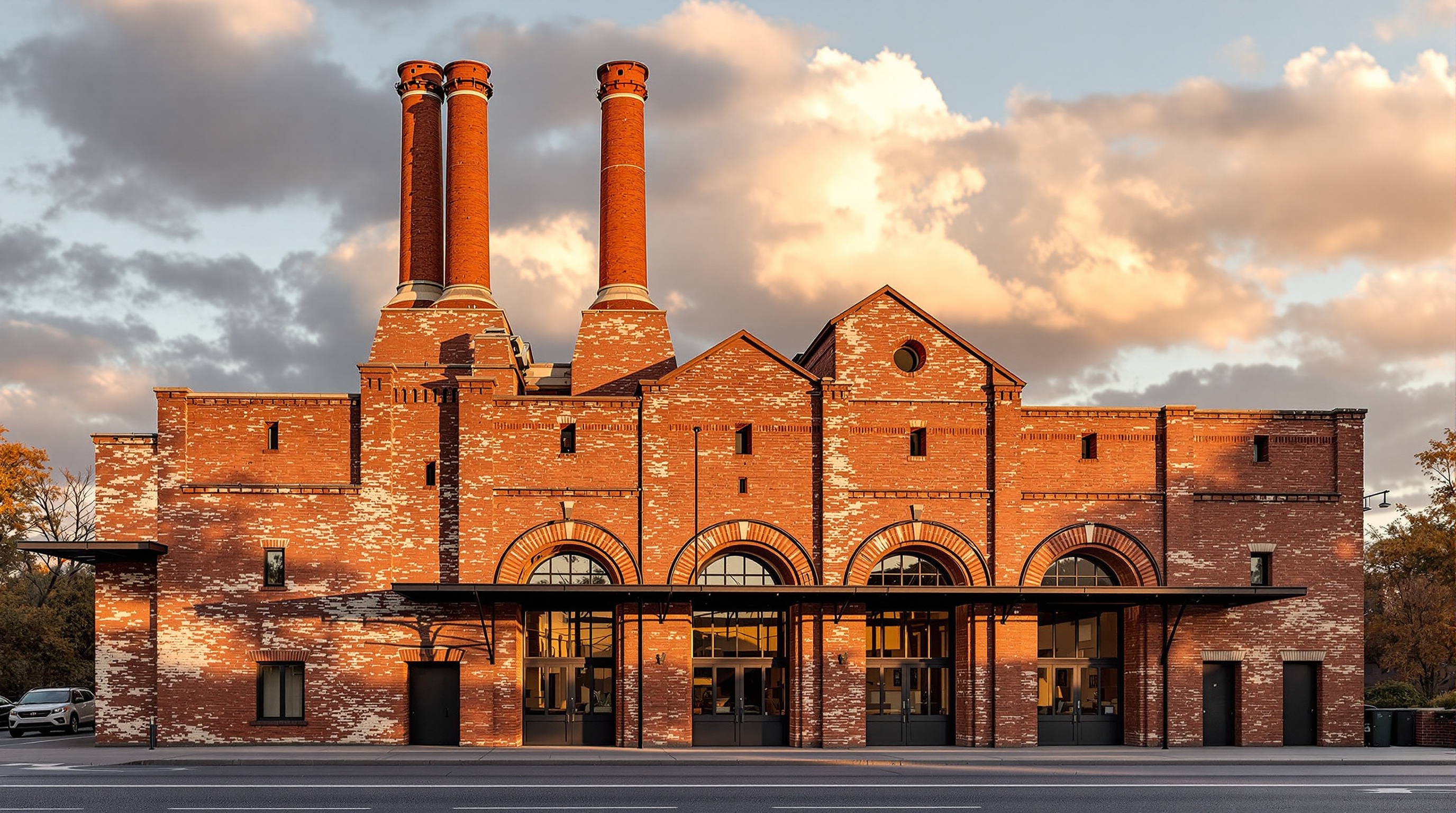
The first thing to understand is what you're competing against. Clients who hire architects in 2026 have seen a lot of AI renders. Most of them are the same: golden hour, warm entourage, vaguely Scandinavian interiors. The aesthetic has been commoditized because the prompts have been commoditized.
What cuts through is specificity. Not "modern residential exterior" but a render where you can see the board-formed concrete reads correctly, where the fenestration pattern makes sense for the climate, where the landscape isn't pulled from a stock library but tied to the actual site. That specificity is only possible when an architect is making the decisions, which is exactly why your portfolio can be better than a generalist AI user's.
The second thing: clients respond to process transparency. We started adding brief captions to our renders two years ago, "Generated from SketchUp geometry in Veras, post-processed in Photoshop", and have never once had a client ask us to remove them. Several have explicitly said it builds trust. Hiding the AI doesn't make the work look more real. Explaining it makes it look more considered.
Specificity is only possible when an architect is making the decisions. That's the gap your portfolio should demonstrate.
The four-stage production workflow
Portfolio-quality AI renders don't come from a single tool and a single prompt. They come from a deliberate four-stage process. Each stage has a job. Conflating them is how you end up with images that look impressive in a thumbnail and fall apart at presentation size.
Concept generation, atmosphere and direction
Use Midjourney v8.1 or FLUX.1 Dev (via fal.ai or locally in ComfyUI) for pure concept work. No geometry. Pure prompt-to-image. The goal at this stage is to find the atmospheric direction, the quality of light, the material palette, the emotional register of the space. Don't try to get accurate geometry here. You're making a target, not a final image.
Geometry-locked render, your actual building
Take your SketchUp, Rhino, or Revit model and run it through a geometry-aware renderer. Veras is the most controllable for exterior work. Krea works well for fast interior variations in a client session. The concept image from Stage 01 becomes a style reference, you're importing the atmosphere, not the form. Lock the seed, run variants on lighting and time of day, pick the best two.
Upscaling and detail enhancement
Every AI renderer outputs at a resolution that looks fine on screen and falls apart on a printed board. Run every keeper through Leonardo Finish or Magnific. Set the enhancement strength low, you want crispness, not hallucinated detail. This step adds fifteen minutes and makes every image presentable at A1. Skip it and you'll notice on the day your boards go to print.
Post-production, the 20% that makes it yours
Open every final render in Photoshop. Color correct. Add real sky photography, AI skies always look slightly wrong and clients feel it even if they can't name it. Clean up the entourage. Hand-paint the windows. The AI got you 80% there. The last 20% is editorial judgment that no model has yet, and it's the part that makes your renders look like renders and not generations.
Prompt templates that actually work
The difference between a good architectural prompt and a bad one is specificity at the material and atmospheric level, not at the aesthetic label level. Below are three starting templates we use regularly. Adapt them, copy-pasting without thinking produces copy-pasted results.
Every phrase you add constrains the output further. If something isn't working, remove terms before adding more. "Modern minimalist residential" is doing nothing. "Board-formed concrete, south facade, 3pm winter light" is doing everything. Specificity always beats volume.
What to include, and what to cut
The single most common mistake in AI-augmented portfolios is including too much. Every AI tool makes generation fast. Fast generation produces volume. Volume does not equal quality, and a portfolio diluted with mediocre renders is worse than a tight portfolio of ten that are genuinely strong.
Our rule: every image has to earn its place against three criteria. Does it show something technically specific about the project? Does it demonstrate a decision an architect made, not just a prompt a software user typed? Would you print it at A1 and put it on a wall?
Cut anything that looks like it came from a template. Cut generic golden-hour renders that could belong to any project. Cut anything where you can't explain exactly what you told the tool to do and why. What's left is your actual portfolio.
Using FLUX Kontext for iterative portfolio work
FLUX.1 Kontext changed the practical workflow for portfolio generation in early 2026 because it solved the iteration problem. Previous tools reset on every generation, you'd get a great base image and then lose it the moment you tried to adjust the lighting or swap a material. Kontext maintains spatial and material consistency across edits, which means you can actually develop an image instead of starting over.
For portfolio work this matters most in the back half of production. You have your geometry-locked render. You want to test a different time of day, or see what the materiality looks like with brick instead of render. In Kontext you describe the change as a delta, "change the wall cladding from render to pale brick, keep everything else", and it holds. Not perfectly, but consistently enough to be useful.
Access it through fal.ai for cloud generation (cheapest per-image cost for occasional use) or run it locally in ComfyUI if you're generating volume. The ComfyUI setup is covered in our dedicated tutorial, it's not complex, but it's also not something to set up five minutes before a deadline.
Where to host and present the work
Platform choice shapes how the work reads. Some quick observations from watching how clients interact with different formats.
Behance and Archinect portfolios read as student or early-career. If that's your stage, use them. If you're presenting to commercial clients, you need something that doesn't share a template with 400,000 other architecture students.
A personal site with a custom domain and clean typography is still the most credible format for practitioner-level work. It doesn't need to be complex. A single-page scrolling portfolio with 10 to 15 projects, tight image curation, and a clear studio voice beats any template on any platform.
PDF for client pitch delivery is not dead. Clients over 40 still open PDFs. A well-designed 12-page PDF with your best six projects and a brief capability statement gives you something to leave behind that doesn't require a login or a browser. Build it in InDesign, not Canva, and version it by project type so you're always sending something relevant.
Are.na is worth maintaining as a research and process record. It's not a client portfolio tool. It's where the people who care about your thinking look when they want to know if your ideas go deeper than your renders.
A portfolio that shows ten strong projects with visible process is a stronger signal than fifty images with no context. Curation is still the rarest skill.
Pitching with AI renders, what to say and what not to say
The question comes up in every client meeting eventually: "Is this what it will actually look like?" The right answer is not "yes" and it's not "no, this is just AI." The right answer is: "This is as close as we get to a finished image before construction. The material specifications here are the ones we'd specify on the drawings. The light study is based on the site orientation. What you're looking at is a prediction, not a promise, which is true of all architectural visualization."
That answer is honest. It's also confident. It positions AI rendering as what it actually is: a more capable, faster version of the hand sketching and physical models that preceded it. Clients who understand what architecture is accept it immediately. Clients who expect certainty would cause you problems regardless of what tool produced the image.
One specific framing that consistently works: when presenting a render, describe one decision it embodies. "We've shown the south facade at 3pm in December because that's the worst-case solar condition for this wall, you can see how the overhang is working." That sentence turns a pretty picture into evidence. Evidence is what you're selling.
The portfolio as proof of judgment
AI tools lower the production cost of a render by an order of magnitude. What that means for architecture practices is that rendering is no longer a differentiator. Everyone can produce imagery. What separates studios now is the quality of the decisions behind the imagery, the site reading, the material logic, the atmospheric understanding that makes one building feel specific and another feel generic.
Your portfolio should be a demonstration of that judgment. Every image should have a reason behind it, a spatial argument, a material position, a climatic response. The AI produced the pixels. You made the call. The portfolio's job is to make that visible.
Studios that do this well don't look like AI studios. They look like studios with a very clear point of view that happen to produce exceptional images. That's exactly what you're aiming for.
No affiliate links. No sponsored placements. Tested by Vista Studios on live project work since 2024.